Lansing Chiropractic
A three-office chiropractic practice moved off Wix onto a fast, hand-built site, with every old URL redirected and the practice's reviews gathered in one place.
- Client
- Lansing Chiropractic PC
- Location
- Lansing, Holt and Jackson, Michigan
- What we built
- Multi-location site · Wix migration · review hub
- Stack
- Astro · Tailwind · Vercel · Resend

At a glance
Lansing Chiropractic cares for families from three offices, in Lansing, Holt and Jackson. We moved the practice off Wix, carried every old address across, gathered its reviews into one place, and chose its colors together with the doctors.
The Holt and Jackson offices trade as Holt Chiropractic and Jackson Chiropractic, and the logo rotates through all three names, so you’ll see “Holt” on some screens.
- 490+ patient reviews 4.9 average, in one filterable hub
- 42 sitemap pages every one answers 200, no redirects
- 96 Lighthouse mobile performance 96 accessibility, 100 best practices and SEO
- 621 → 0 structured-data errors Semrush crawl, July 2026
Source: the live site and a Semrush and Lighthouse audit, July 2026.
Before and after
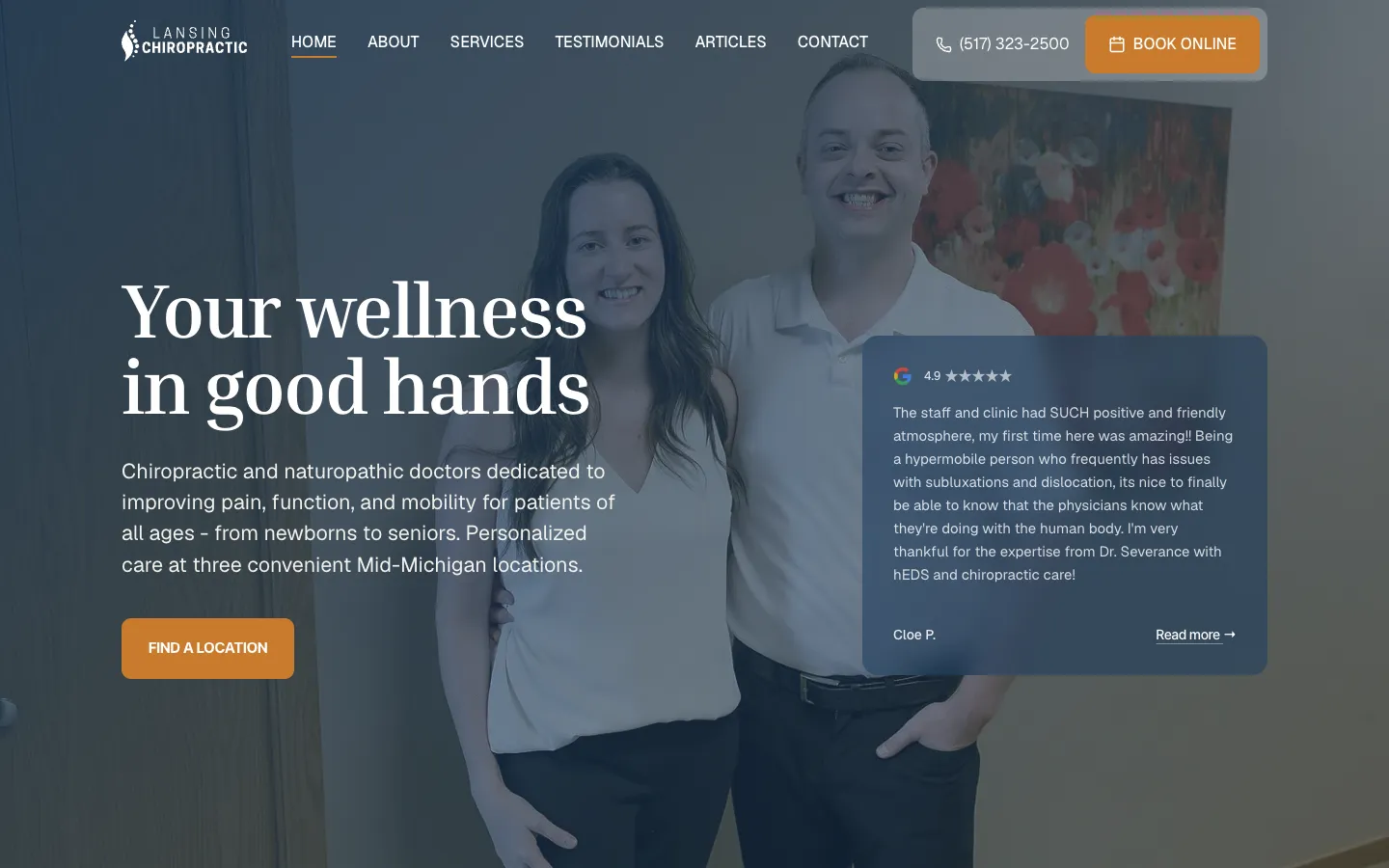
The home page before we started, and today. Drag the line, or focus it and use the arrow keys.

Before: the practice’s Wix site at lansingchiroclinic.com, as the Internet Archive saved it in April 2026 (see the archived page (opens in a new tab)). After: the new home page, September 2026.
One practice, three front doors
The practice had outgrown its Wix site. Patients arrive hurting, often on a phone, and want to know three things: can they help with this, which office is closest, and can I book today? So the site is organized that way. A locations hub leads to a page for each office with its address, phone, team and a Book at this location button, and thirteen service pages cover what the practice treats.
The photography is the practice’s own. A patient who books in Holt sees the room they will walk into.
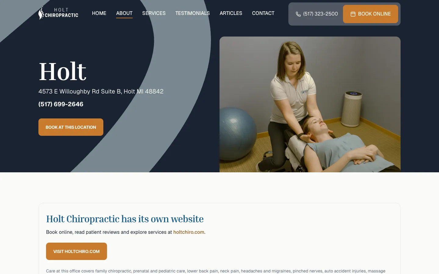

Every office gets its own page: address, phone, team, and booking one tap away.
Colors chosen with the doctors
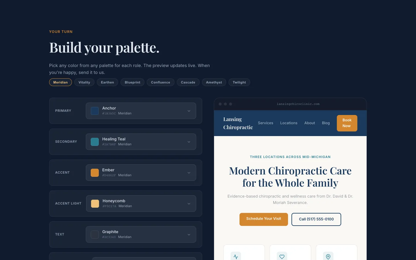
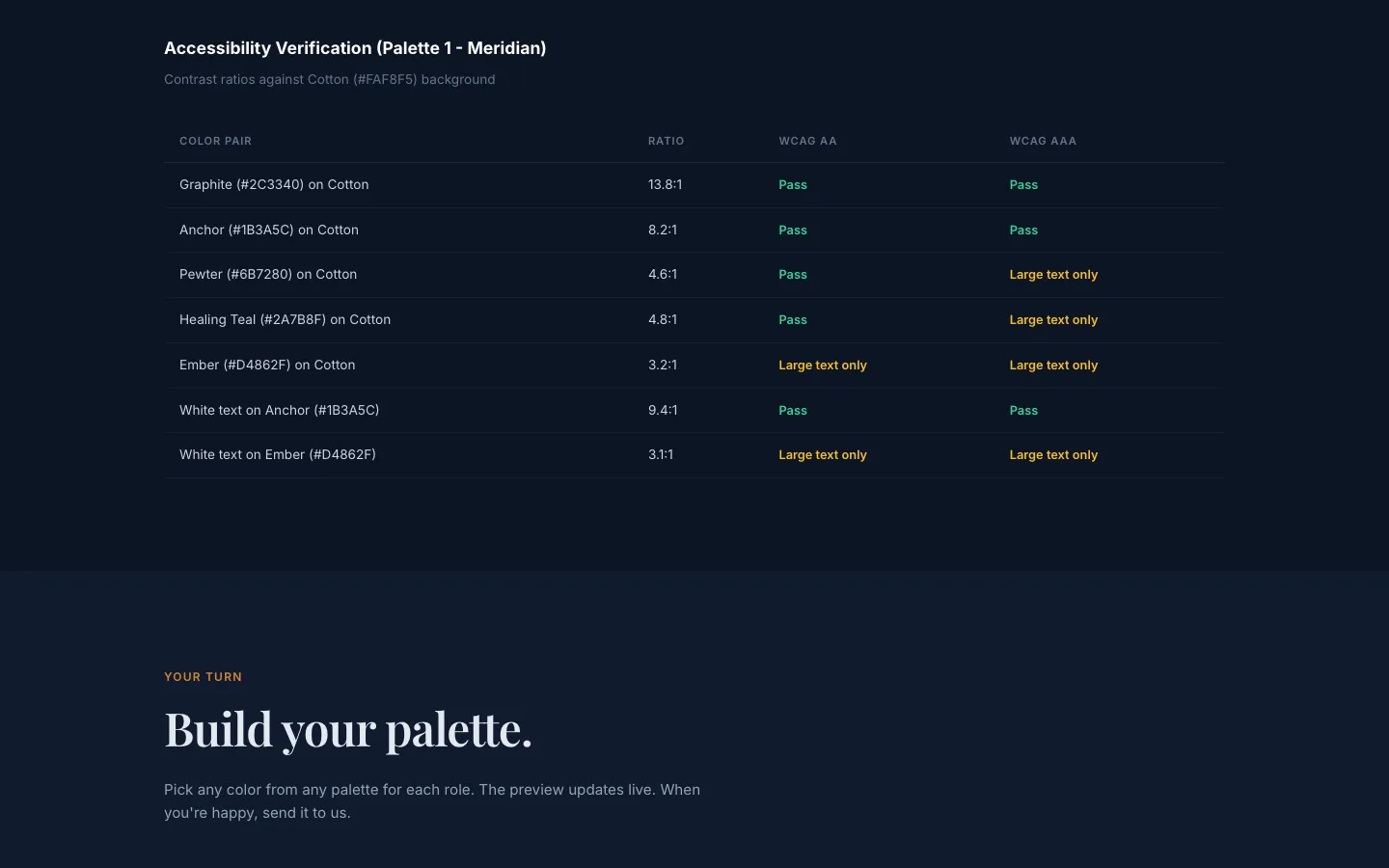
Rather than send a PDF of swatches, we built the doctors a palette page of their own: the reasoning, a set of named directions with contrast checked, and a builder that paints any combination onto a mock of their home page. One button sent their choice back to us. The palette on the live site came out of that back-and-forth, not a single presentation. Try four of the directions below.
| Pairing | Ratio | AA |
|---|---|---|
| HeadlineLarge text, needs 3:1 | 6.54:1 | Pass |
| Body textSmall text, needs 4.5:1 | 4.55:1 | Pass |
| TaglineSmall text, needs 4.5:1 | 3.59:1 | Fail |
| Menu on headerSmall text, needs 4.5:1 | 6.84:1 | Pass |
| Button labelSmall text, needs 4.5:1 | 3.3:1 | Fail |
Meridian. The first recommendation: navy for trust, Healing Teal to bridge toward wellness, and Ember amber like the walls of the Lansing office.
Earthen. Split-complementary: forest blue-green, with terracotta in place of plain orange. Its body text and teal tagline fall just short of AA.
Confluence. Meridian with the teal sampled from the practice’s logo, added when the doctors asked for more of it.
Blueprint. Neutral-led, so the practice’s own photos set the tone. The practice chose it, and it is the live site’s theme. White on Harvest measures 3.3:1, so Harvest stays for fills and headings and the buttons use a deeper #A8641F: 4.66:1.
Blueprint: 3 of 5 pairings pass WCAG AA.
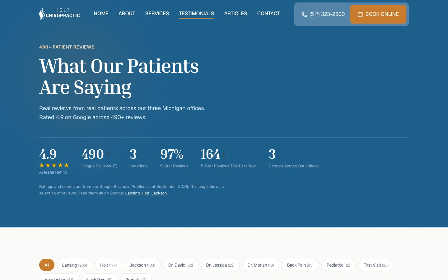
Nearly five hundred reviews, in one place
The practice’s best argument was already written by its patients, spread across three Google Business Profiles and Yelp. We gathered them into one hub you can filter by office, doctor or condition, so a parent can read what other parents said about pediatric care in Holt. Twelve focused review pages sit underneath, linked from the doctor bios and office pages they support.
For engineersA lighter hub, and review markup Google will accept
We cut the hub from 1,734,177 to 438,346 bytes, about 75% lighter,
while keeping every review available to the filters. We also removed the per-card
Review markup: Google treats reviews a business publishes about itself
as ineligible for star results, and Semrush was counting hundreds of them as invalid.
The on-page markup now describes the clinic accurately instead.
Leaving Wix, then checking the work
We listed every URL on the old site and mapped each one to its closest new
page: /service/neck-pain to the new neck pain page,
/good-faith to the Good Faith Estimate, the old blog to the new articles.
Nothing was pointed at the home page, which Google treats as a missing page. The site
settled on one address, www.lansingchiroclinic.com, used in every
canonical tag, the sitemap and the structured data.
In July 2026 we audited it end to end. Speed was never the problem, so the work went
where the reports pointed: Semrush found 621 errors, nearly all in
structured data, including doctors described as clinics, and a later Ahrefs pass caught a
Chiropractor type that does not exist in schema.org. We fixed each one at its source, and the count
went to zero.
- ListEvery live URL on the old Wix site.
- MapEach to its closest new page, with safety nets for the rest.
- AlignOne www host in canonicals, sitemap and schema.
- CheckEvery sitemap URL answers 200 on the live site.
The result
Lansing Chiropractic now has a site that speaks for all three offices, with service pages, patient guides written by its doctors, a short contact form behind Cloudflare Turnstile, and nearly five hundred reviews a visitor can actually search. It left Wix with every old address accounted for, in colors the doctors chose themselves.
A site built around how patients choose, a move that keeps what the practice had earned, and the checks to prove it.